that`s the summer project all over and now it`s time for a mammoth summary.
back at the start of the holidays we were invited to talk to the tutors to see what the project was about, they wanted to create an experimental prototype game engine for a client as a sort of test run of a new module for the computer arts year 3 course.
it will be replacing the advanced interaction structure if this project was a success, it all depends on what Robin and Lynn hear back from the committee board, or some other hierarchy which decides the university module.
that`s a story for another day, i`m gonna show off my work for the project, the task in question was to create a `interactive product` to explain to the general public
1.why the sand dunes on st.Andrews beach are important
2.why they shouldn’t walk over them
3.why the seaweed is left on the beach
the answers to these question for reference is so the dunes will stop the ocean from eroding the coastline and flooding the nearby golf course, tourist walking on the dunes causes damage to them and seaweed helps fortify the dunes mass and integrity.
in this early stage we got to see the game engine we would be developing for in action, it was being used for a tech demo showing real time effects on architecture in a 3D Dundee using a free roaming camera, which was a seagull you controlled with a Wii remote.
we also had various other lectures explaining color schemes and how to adapt stereoscopic 3D graphics properly. we also got to check out various techs like augmented reality and widescreen monitor touch screens.
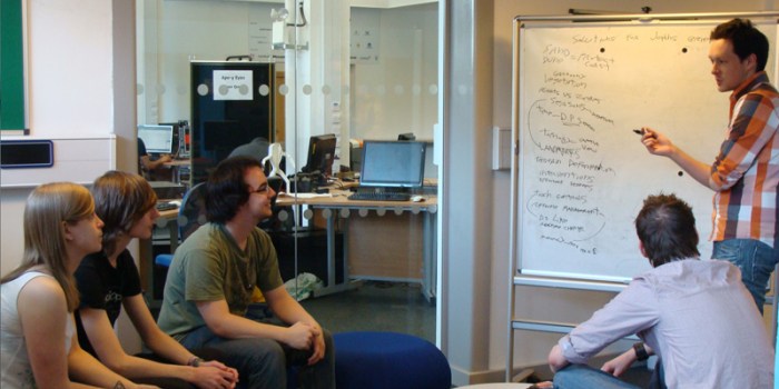
shortly thereafter we had a brainstorming session and it was extremely productive! usually in university modules conceptualization can take weeks but we banged out some great ideas in the space of 20 minutes and revised the ones we wanted to use.
i believe this board is where the idea of a camera strapped to a seagulls head originated from. during this sesh we actually at one point had the idea to use haptic glove technology to mould the seaside landscape like play doh to terraform the environment and protect the dunes, not totally unlike the recent indie blockbuster from dust
honestly, quite surprised at why brainstorming hasn’t been formally introduced into the curriculum already, but that`s what the dacii project is hoping to change.
shortly after whittling our ideas down to a manageable few and banging out some quick concepts we had our first presentation to the tutors. as can be seen here, we were guided away from making a conventional game but the aspect of protecting the dunes from erosion was so synonymous of tower defense and our resource management and camera angles reminded everybody of strategy games.
in the end we went ahead with utilizing the screens to make a giant Nintendo 3DS, touch screen on the bottom for controls and a top screen above for viewing the beach in real time stereoscopic 3D. we decided against using augmented reality or haptic technologies because accessibility was a driving factor.
here`s some of the first assets i ended up creating.
initial layout.
the map is always on the dominant hands side since scrolling to move the camera is a dexterous task. it`s in right hand mode right now.
animated flowers. click em
these are meant to show the style we proposed the plant life should have. we didn’t want static realistic plants but opted for stylized 3D models with lot`s of flair in their movement. plants vs zombies was a big inspiration in this aspect.
made 10 minutes before the presentation to show off the warden idea. dat lens flare!
for actually guiding the player and to act as a tutorial of sorts, we proposed a beach warden who would appear on the top screen alongside a text box in a very phoenix wright style fashion.
by this point i was already creating some buttons to use for quick prototyping.
various styles for the base button.
spritesheet for various button layers and map bases.
so these were the fundamental ideas we had in place, they would continue to evolve some more once we had actually gone to the beach to speak to the environmentalists and the warden.
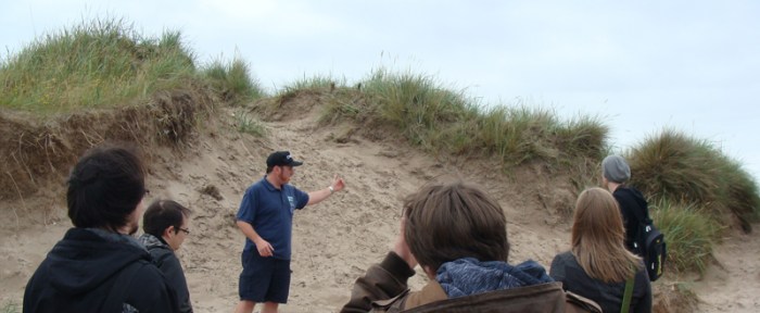
here is all of us looking at the exhilarating sand. looks closer and you can see the wardens epic sideburns.
we got loads of photographs to transform into textures and to use as a form of reference and research so it was invaluable, field research would be a great addition to any module. however, the beach was a lot less complex then we first imagined. there aren’t different plants for different season. just grass. all year long.
now at this point, i revised the interface so it would change theme depending on the season. blue background for winter obviously. i wanted to have animations in the background as well to stop it looking sterile.
for example, in the blue winter background the snowflakes would fall down vertically, and in the yellow summer the pollen would rise upwards. autumn and spring leaves/petals would move horizontally so each season was different.
for the map section of the interface I originally created sprite assets. influenced from nes-ish game graphics. also used this style because they were quick and easy to create. and were easily tileable.
i`d like to do sprite graphics more in future and get better at them, and this was possibly a factor in why i chose to use them for the map first time round.
during some of the lectures we got talks about accessibility and technological innovations for disabled users, after doing a bit of my own research on ted.com i found some videos on al gores latest iPad book, and this was a big influence on the design. it was so slick and minimalistic and totally rocked the `save the planet` aesthetic. (whereas ours is more `save the dunes`) as for actual interface structure and navigation tree`s I looked at Pokemon. common things like doing an attack should take no more than 2 menus. and i tried to apply the same philosophy to the interface design.
as you can see, the structure is simple but it works. it makes sure the player is engaged without so much input it becomes tedious.
later on we got a widescreen redesign meaning i could fit a lot more buttons on screen so this was streamlined even further.
here`s a link to a demo of the first interface
we presented everything thus far to the tutors and got some good feedback. there was a lot of clashing art styles, like with the sprites,semi realistic 3D and cutesy warden so were advised to reel everything in a bit.i did my part by recreating the map system from scratch. we got rid of animals from the game and made time manipulation a more prominent feature, whereas before to move time you had to go deep into the seasons sub menu. got rid of animals too, at the request of the 3D modelers quite understandably. another change was to simplify 3D navigation so we removed some of the camera controls in favor of preset cameras and instead of scrolling on the map to move the camera, simply touching grid squares would zap the camera there.
 graphics used for the time slider. inspired by time sliders on dvd and audio playback softwares.
 the new map assets. bit bland but they get the job done.
 here`s the revised,widescreen interface. this is what it looks like when the erosion display is toggled on.
 placeholder warden I made until the final ones were ready.
here`s the script for the warden dialogue i wrote if anyone’s interested. i took a lot of inspiration from the Mario rpg`s in the style of humor.
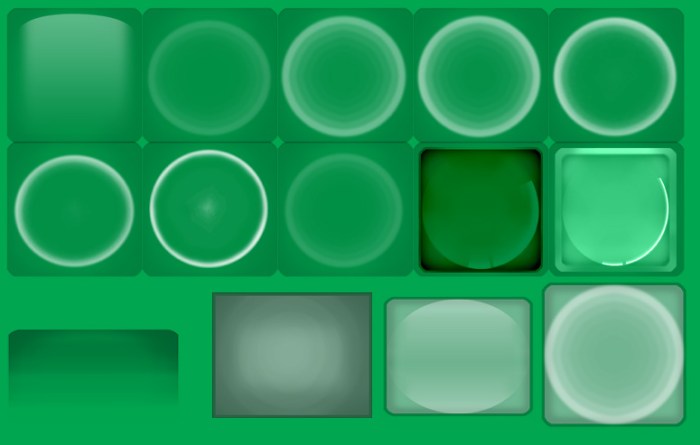
and before I forget,here`s a big ass image of all the buttons.
 im becoming painfully familiar with the term `pallete-swap`
unfortunately there is no video footage of the final product as of yet, so you`ll have to make do with some mock up screenshots!
butt chin!
as soon as it`s made available to me I`ll post it here so i may show off the glory of my work! have to give a mention to our coder Chris he was so sound and hardworking despite the millions of assets we threw at him and expected to be stuck in the game.
the final presentation went pretty well and I`m relieved to know that the product will continue to be developed. turns out I could continue to work on it in 4th year and i think i`ll do that.
it just means my honours project will be based around interfaces which is fine I guess, i`ll still be drawing 2D art and im glad i`ve finnally settled on something. i had my heart on creating a retro inspired 2D platformer of sorts, but that would be difficult to work a 10k essay around so this is probably for the best.
there is a lot to write on the subject of interfaces so that’s a plus. things like designing around motion controls, styles, various hardwares. lots to think about. and quick! last year of uni is just around the corner!
disclaimer:photographs belong to the university of Abertay and also the higher education academy.


